The House at the End of the World: Cover Decision
COVER REVEAL: HOW I CHOSE THE COVER FOR FG#7
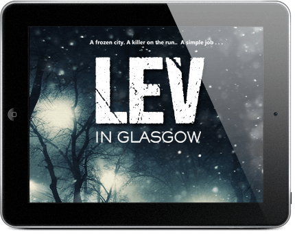
Here’s how the books look in North America …


Here’s how they look in the UK …


HERE’S WHAT I WANTED TO ACHIEVE …
The elevator pitch for this book is simply this:
![]() Homicide detective
Homicide detective
![]() Used to think she was dead (Cotards)
Used to think she was dead (Cotards)
![]() Murder investigation
Murder investigation
![]() Secure psychiatric hospital
Secure psychiatric hospital
![]() 50 special forces veterans as inmates
50 special forces veterans as inmates
The mood is dark, intelligent and although there will be violence (and swearing), the violence will be dark rather than gory.
The psychiatric hospital is on the extreme west coast of Wales, so the obvious design choices have to do with cliffs, waves, and buildings glimmering above. Obviously, there’s a strong female central character, so although most of my books haven’t featured a figure, the design could definitely accommodate one.
I asked my designer to come up with some ideas based on this general guidance. I sell more in the US than I do in the UK, so we’ll be following the US look, not the UK one. At that point, it was over to him to do his stuff …
WHAT MY DESIGNER CAME BACK WITH
My long-time, incredibly talented designer is Arnie (who, by the way, is mostly a web-designer. He only got into cover design because of me and, though it’s quite a specialist field, still produces covers that glitter with conviction and intelligence. I love them.)
Here’s our top choice of image – great seascape, great building, great sense of adventure, nice use of character – and of course the typography and so on consistent with the very strong look so far in the series.

DISCARDED MOCK-UPS
Here are a couple of mock-ups discarded through the design process.
Do you approve of our final choice? Love it? Hate it? Or what. Let me know.